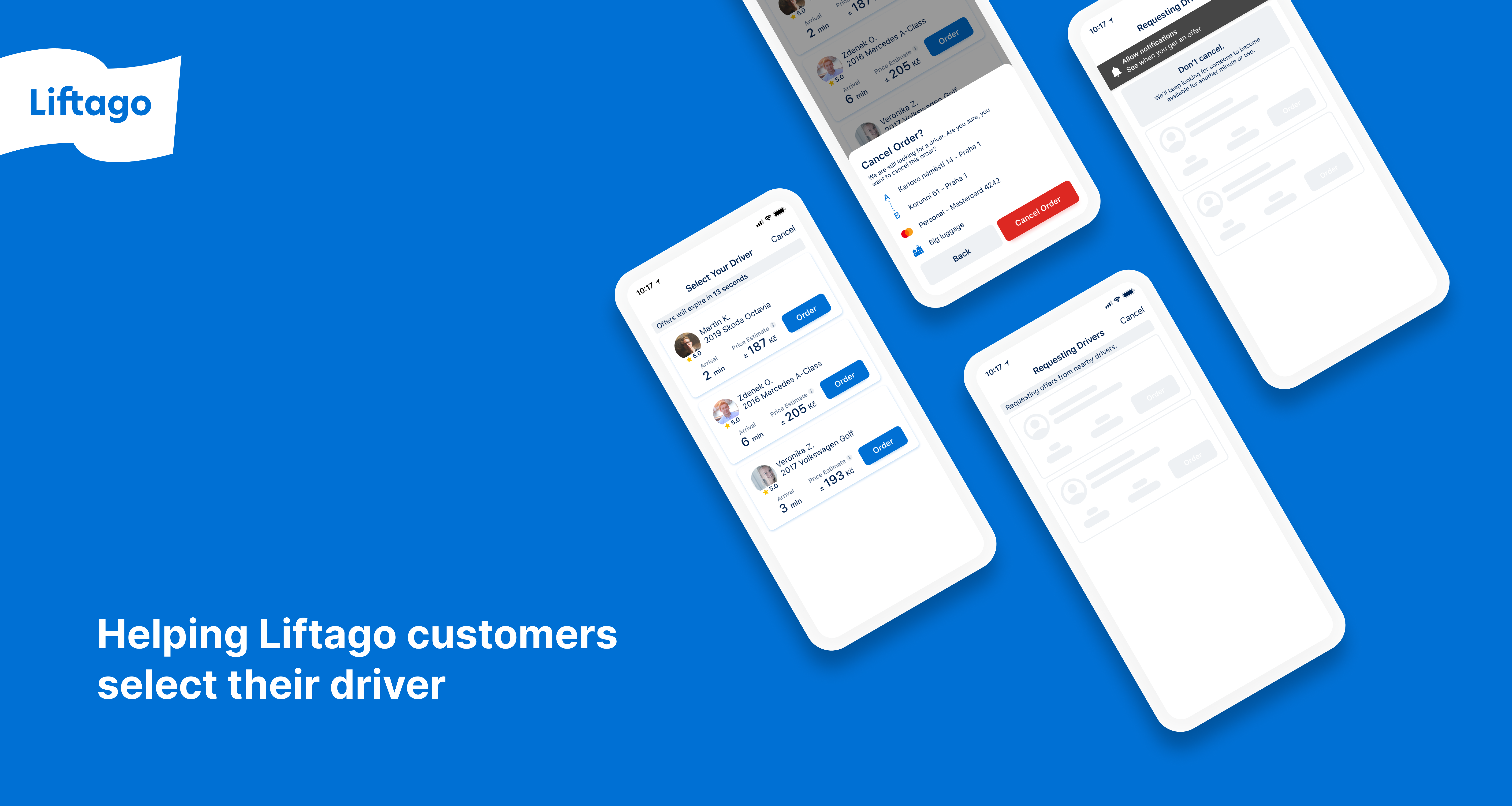
Redesigning Liftago’s Driver Auction
Role: Product Designer and Owner
Liftago customers select the driver based on the price, time of arrival, driver’s rating, and other bio criteria. As a product designer, it was my job to help them make this choice with confidence.
Respecting the business
The concept of choosing your own driver based on any criteria you care about is the main selling point of Liftago.
Liftago prides itself with more premium services than other ride hailing apps (such as Bolt or Uber) which gives the business a competitive edge in a fairly saturated market. Liftago team cherry-picks reliable drivers through a thorough vetting process. The returned trust of Liftago’s customers clearly shows this process pays off.
Any changes to the driver selection UX involve a huge responsibility to Liftago’s valued customers and to our drivers also.
How does the auction work exactly?
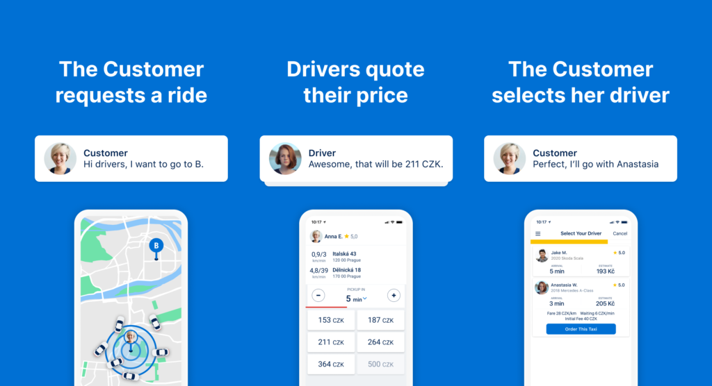
Every time a Liftago customer requests a ride, nearby drivers see the inquiry and can choose to offer her their services at a tariff price the drivers see appropriate. The customer then selects a driver based on her preference.
So what was wrong with it anyway?
Despite the fact that the conversion of Liftago’s funnel happens in this step, the UI did a poor job of helping customers select their driver.
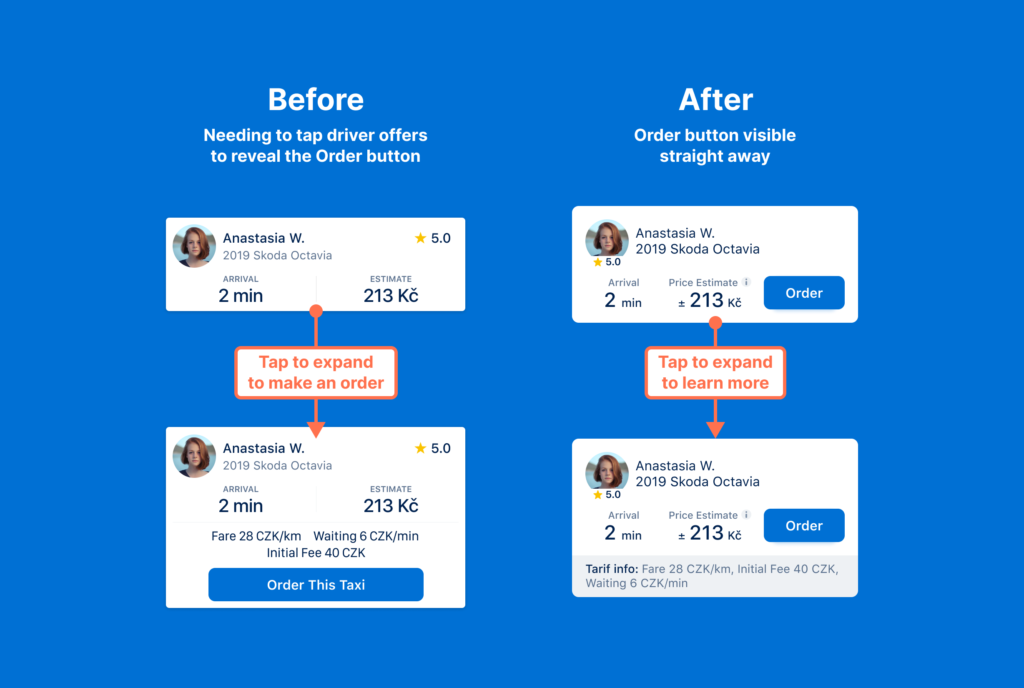
1. The order button no where to be seen
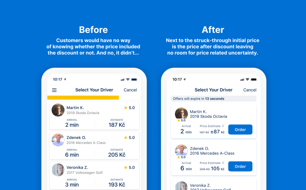
Even though, this is where you order a ride, there was no order button, just a list of drivers which resulted in customers’ uncertainty where to tap.
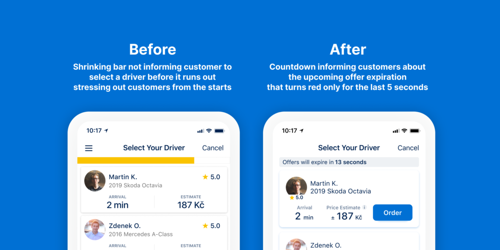
2. Stressful, non descriptive progress bar
Instead of informing our customers how much time they had to select their driver, we displayed a stressful shrinking bar with no description whatsoever that would slowly turn red and run out.
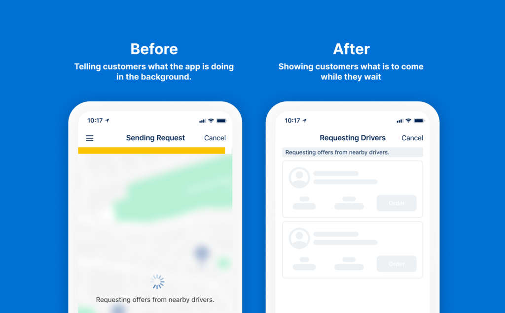
3. Failing to utilise the waiting time
New customers would have to scan and understand the layout of displayed driver offers in a very short amount of time during which they would have to select one of them. This was a lot of mental effort required at a time after having to sit and wait doing nothing.
4. The customers’ orders were spamming our drivers
Behind every offer available is a driver waiting for the customer to make their choice.
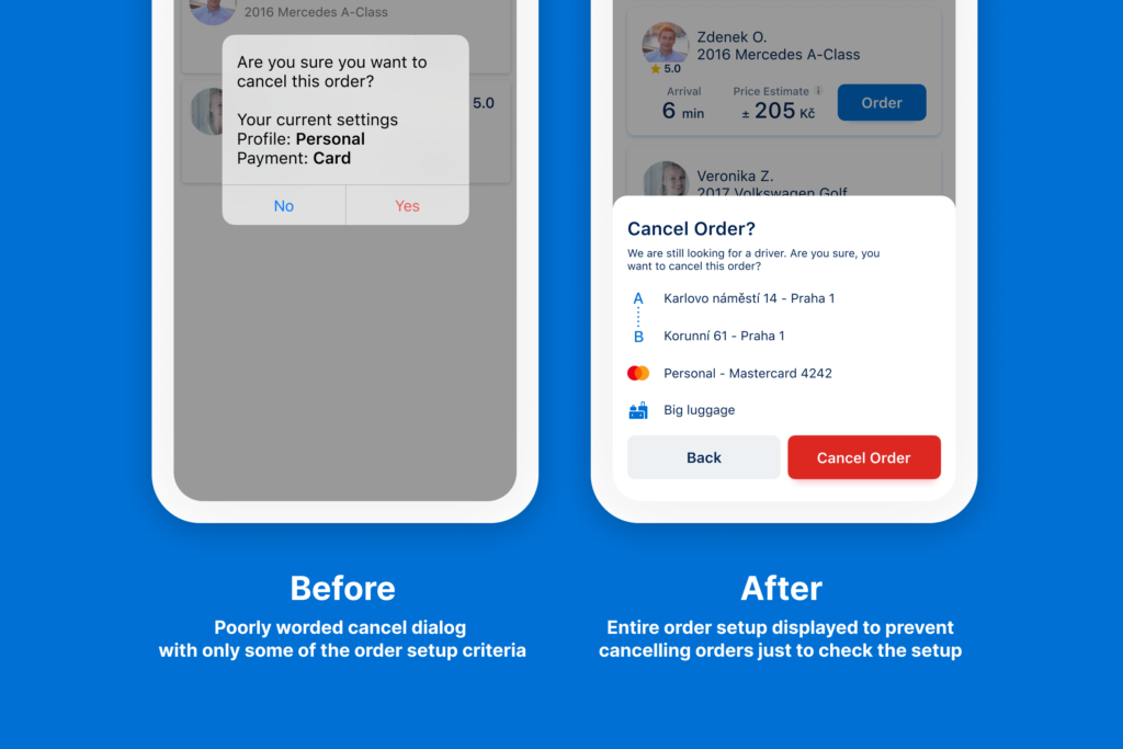
Customers sometimes repeat the order multiple times. This can be for many reasons outside of our control but the one reason that is in our control is when customers would cancel and repeat their order just to check whether they had set up the order correctly.
5. Handing out promo codes without showing the lowered price
Referrals in particular used to be one of Liftago’s main customer acquisition tools and yet in the most crucial moment of its funnel, the customers didn't see the discount they would get.
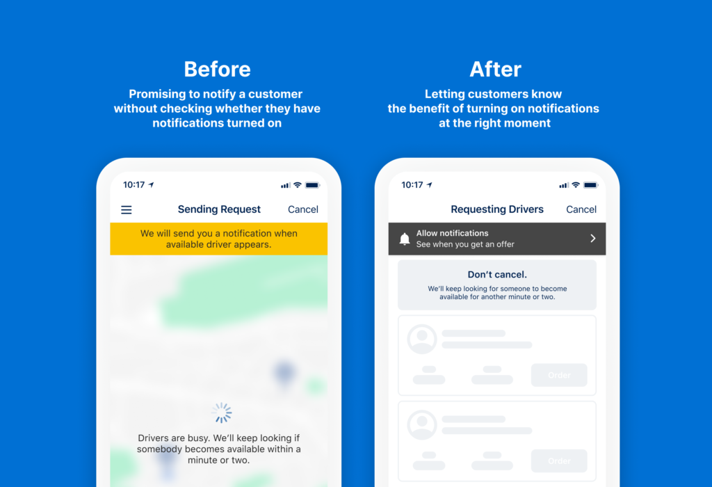
6. We’ll let you know... Oh wait, but you have notifications turned off
Promising to notify a customer as soon as we find them a ride doesn’t work unless we check if they even have notifications turned on.
What’s in it for the business?
Since this is the place where customers decide whether or not to ride with our drivers, it is crucial to measure the impact of any changes made.
Happy customer, happy driver, happy Liftago
Number 1 priority is to increase the likelihood a customer will select one of the drivers in the presented selection.
Drivers should be less annoyed
The UX improvements should lower the number of inquiries needed to select a driver per customer resulting in less order spamming.
We also looked at auction timeouts and ride cancelations for the same reason.
Oh shoot, our big phoners aren’t showing up
After a few weeks of running the A/B test we could already see the results were slightly in the favour of the new version but the plus sized phone owners that usually perform better in all of our other tests performed noticeably worse.
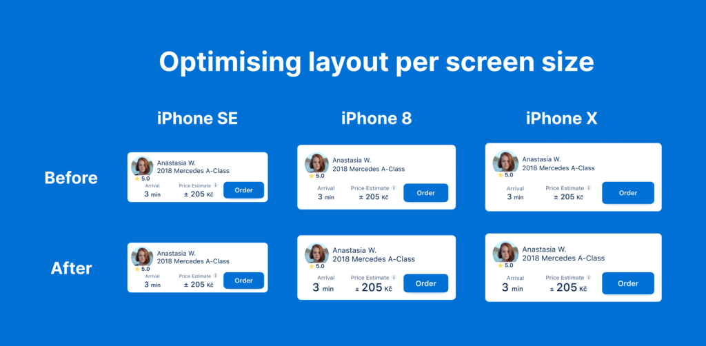
It took us a while to realise that fitting the order button into the collapsed driver offer meant I had to make sure that it would fit even on small phones. However, I forgot to also take into account plus sized phones where the offer looked a bit too tiny.
One quick layout fix and we were ready to roll again.
Aaand drumroll... it is a success.
Once we fixed the layout issue even the plus sized phones started performing better and with it the numbers were not only slightly but decidedly better.
The UX improvements have also made a mark in the mentioned side metrics.
Conclusion
This project was a fun one. It wasn’t the classic “come up with an intuitive way to do X” as much as it was optimising one crucial step of an existing design and refining all of its fine details and many edge cases where each 1 percent of conversion gained creates so much impact for our drivers and subsequently for Liftago itself.
Thank you for reading.
