How I cut the time to order in the Liftago ride hailing app
Role: Product designer
When I was being hired, I had emphasised that ordering a ride in Liftago passenger app was dreadfully long and unintuitive. After Liftago hired me as their new Product designer, it was my first big task to fix the flow’s UX and raise its funnel conversion.
What did customers struggle with?
Confusing first step’s UI
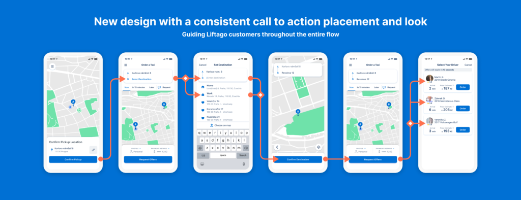
Right off the bat, customers had to spent time figuring out what to do. The idea behind first confirming the customer’s location was solid but the presented UI did not present any obvious way to do it.
If you too are wondering, the checkmark icon was the call to action here.
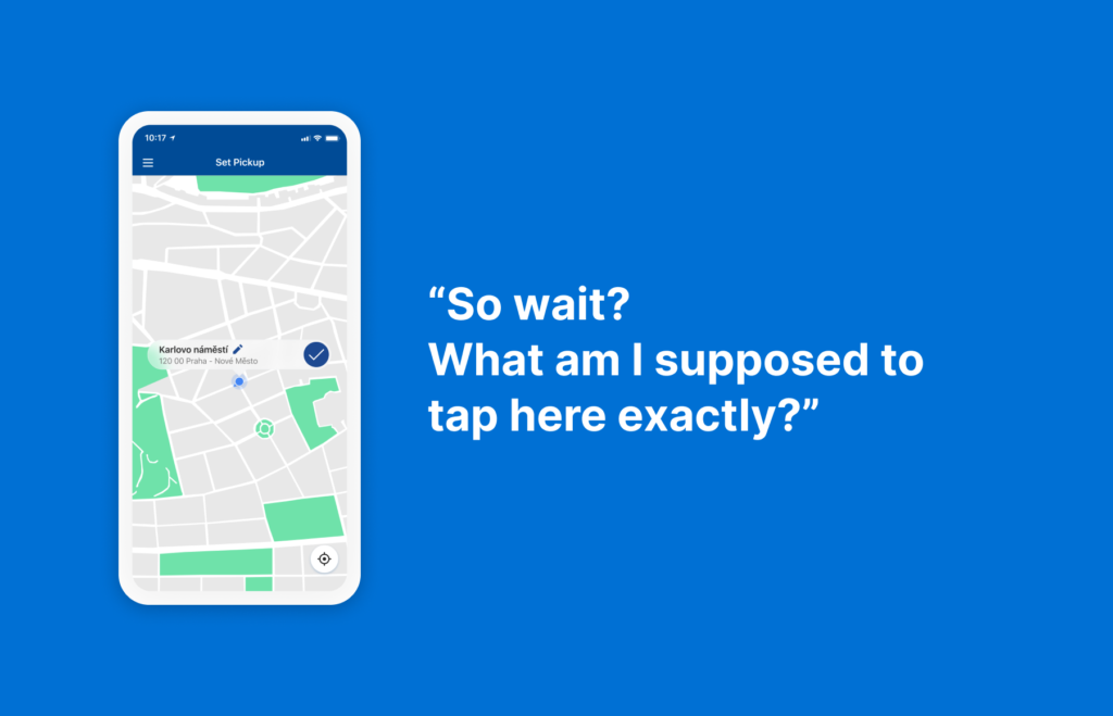
Disrupting customers’ focus when not needed
Before customers even finished entering their route, they were given an option to access the app’s menu, change their payment method and profile, or to schedule the ride for later. It was a unnecessary way to sway them off the task at hand.
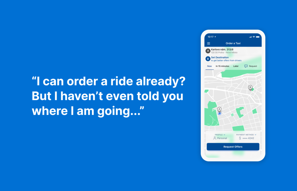
Repeating the same step twice
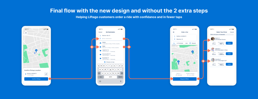
Customers didn’t understand why they should confirm the destination address via map after they've already entered it via keyboard.
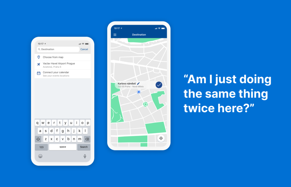
Tapping actions all over the screen
Customers were spending extra time figuring out each step because the call to action buttons were not in a dedicated part of the screen throughout the flow.
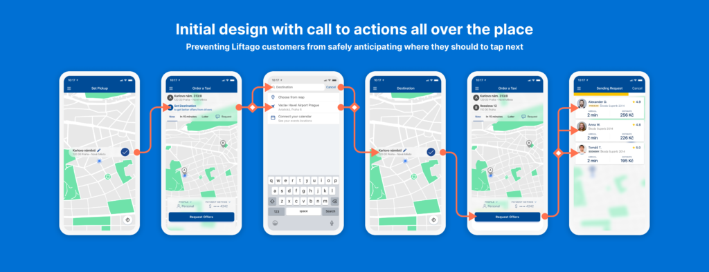
Seizing opportunities along the way
Creating a new visual language
I had previously got Liftago’s CEO and other stakeholders on board with the fact that the app is overdue for a visual upgrade. Seeing that the changes will involve a lot of refactoring from our app team and new components will need to be created, it was the perfect time to introduce a new visual language for the app as well as to start a design system (Keep in mind, this was the start of 2019).
Updating Liftago’s brand
Meanwhile, Liftago’s marketing team had hired an external brand designer to redesign Liftago’s visual identity and communication. The new brighter blue colour is part of that refresh.
Did customers understand the changes?
Coming from a QA background, I was happy to hold a couple of usability testing sessions to know whether I should to make any changes to the design.
I had created an interactive prototype and had asked my colleague from customer research to gather diverse groups of customers. Then, over a couple of weeks we had tested, validated and iterated the design to know that we could move on to development.
One last thing before the release
While I had also conducted UX interviews among our team, now that the new design was developed, it was time to test it in the real world. And since Liftago’s team can take rides for free, it made sense to release the new design under a feature flag and distribute it only to our team first to get last round of feedback and catch any errors and oversights.
After that, we used LaunchDarkly’s percentage-based release function to roll out the design first to 10% of our users, then 25 % and finally 50 % with the other 50 % still seeing the old version allowing us to evaluate the redesign’s success.
How does success look like in business terms?
As with any other important funnel changes, if the numbers don’t prove you made the product better, you probably didn’t.
Let’s look at the two main metric goals we tracked.
Funnel conversion is king
When customers’ enter their route and order a ride they go through Liftago’s critical path and so increasing its conversion funnel is the main objective of this project.
Fewer taps should equal less time needed
Additionally, since I reduced the numbers of steps and made each of them more intuitive customers should walk through the flow faster.
And the end result?
While I cannot go into the actual numbers, I am happy to say that:
- The funnel conversion had increased by a noticeable amount - This was even more apparent when looking at new users that now didn’t get confused at the previously challenging steps of the flow.
- And the time spent on completing the flow had decreased - I guess in this case fewer taps really does equal less time needed.
Next steps
Interviewing our customers also gave us insight on what we should focus on next
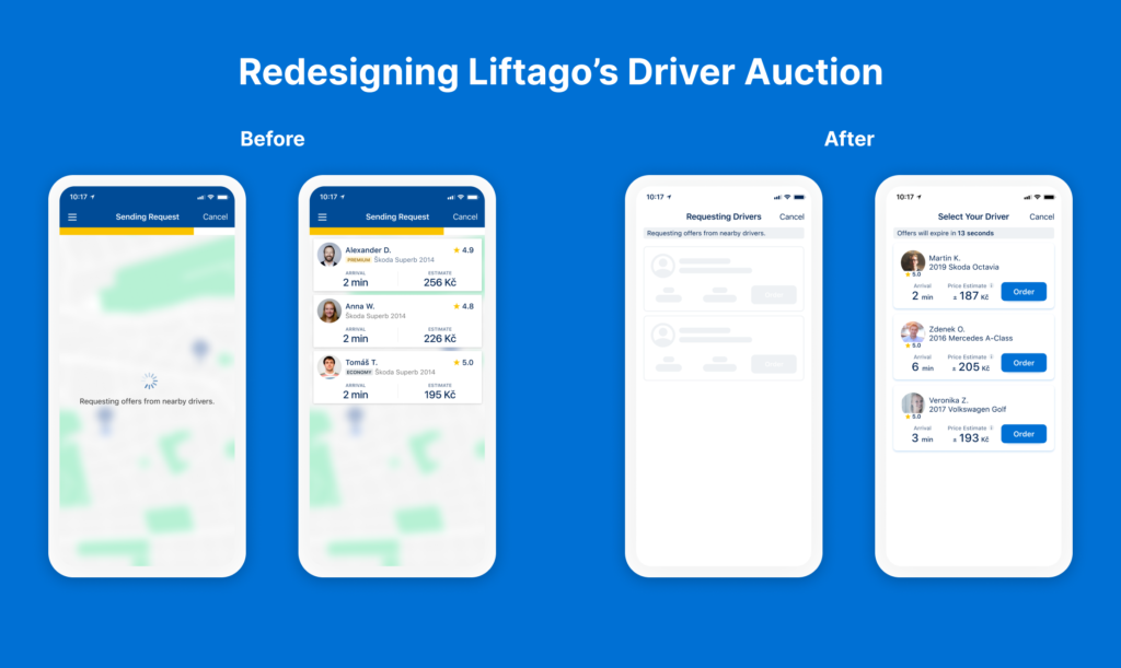
Optimising Liftago’s driver auction
You may have noticed I did not talk about the last step of the flow where customers select their drivers. This step is a unique part of Liftago that separates us from other ride-hailing apps like Bolt and Uber. And it is also where our customers actually make an order so it is crucial to optimise it for conversion
Interviewing our customers gave us a good understanding on why they valued having a choice and also what we could improve to help them make it.
Read how I tackled it: Helping Liftago customers select their driver
Order Overview Iterative Redesign
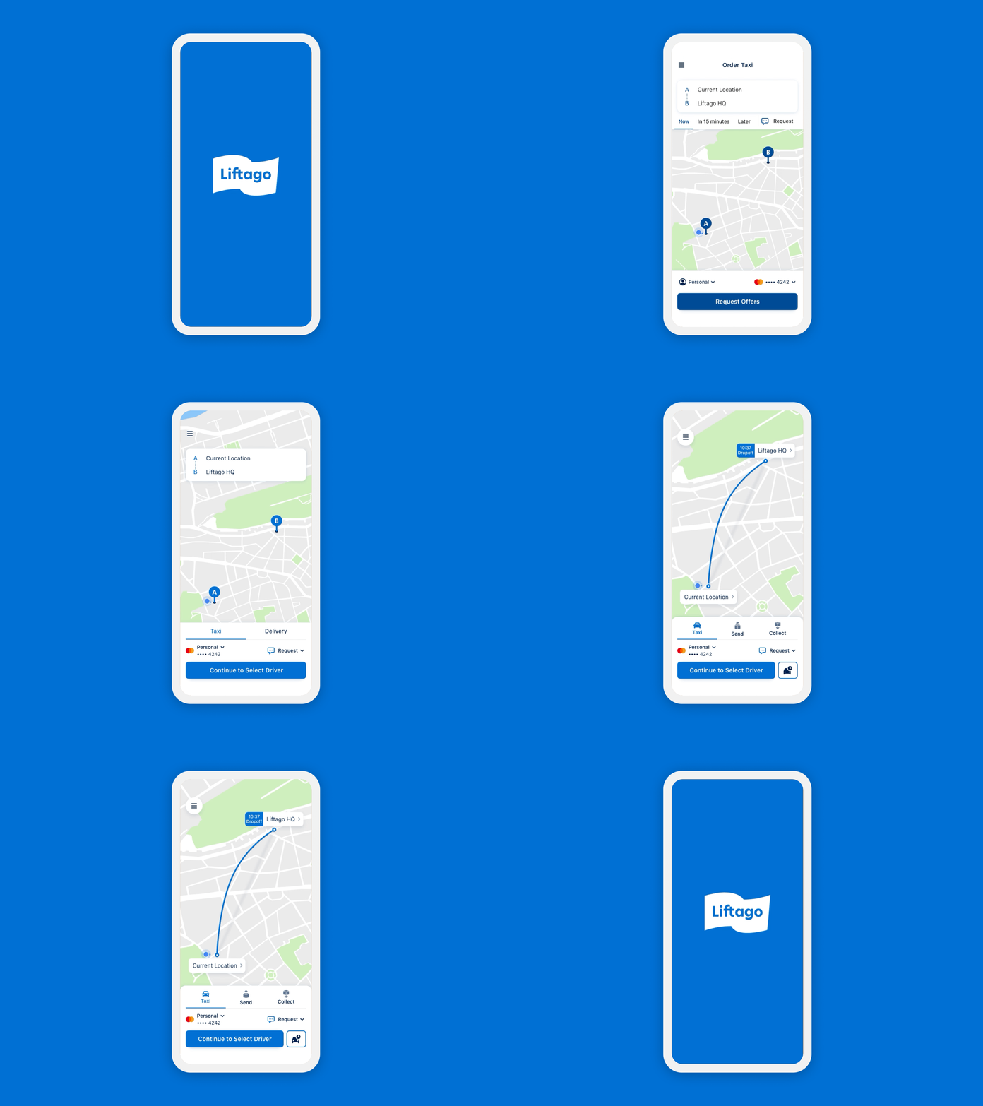
Another thing that became evident was that we should simplify our Order Overview screen. Customers had to look all over the screen to set up their payment details, specify any special requests for the ride or schedule the ride for later.
Watch how I simplified this step by merging some sections together and by moving most of the UI to the bottom of the screen further guiding the user’s attention in a consistent manner.
Key takeaways
- Respect existing mental modals: If you want customers to tap on something, make sure you present them with a button and not some random icon in a circle.
- Let your customers finish what they are doing: Once you ask customers to enter a route, let them finish entering it before asking them about the specifics they might want from your service.
- Guide your customers visually: Use a consistent call to action button style and placement.
- Talk to stakeholders during big scope projects: Try to capitalize on inevidable app refactorings by introducing a new visual language or components.
- Build a design system: App redesigns are the perfect time to start a design system if you don’t already have one.
- Always test, interview and iterate: Unless you let real people use your designs, you won’t know if they work.
- Always roll out new versions slowly: To avoid any unforeseen release disasters, make sure you rollout new versions over time.
- Measure the impact of your features: If you don’t know the impact new designs bring to the business, you won’t know whether you should keep them around down the line.
- Build a future vision for the product: Discuss and envision how to product should grow in the future so that your designs can contribute to a larger vision. You avoid design debt by doing so.
Conclusion
Liftago had put a lot of trust in me when they have entrusted a project of this scale and importance to me right after hiring me and I am glad that the very first project I designed at Liftago was a success.
It has taught me to consider the product’s business model right off the bat and I got to learn how to measure impact quantitatively from funnel data in addition to my already existing knowledge of qualitative testing.
I was happy to cultivate a new design system and language at Liftago which has ultimately helped us in many projects down the line.
